Information Center
What Makes A Good Juried Image?
This is the most frequently asked question I hear as a photographer. The answer from my perspective is elegantly simple: whatever works. Andy Warhol said that “a good photograph is one that is sharp and of a famous person.” Quality, known in the industry as “production value” was not even a factor for him. The same has been said for a juried image.
If you are famous in your field, and your product is photographed with a flash on the camera, this might suffice. Thus several jewelers have shown me dreadful photographs of their work and said, “ I got into the Smithsonian Show with these pictures.” The rest of the jewelry making community has relied on a mix of superstition and dogma regarding “what the jury wants.” Let us admit that “what the jury wants” at the beginning of the jurying process may not be the same thing it wants by the end of that process.
Everyone who sits on a jury begins by asking to see the qualities of clarity inherent in the piece. They do not want to be bamboozled or manipulated by the props that are used in advertising photography. This is the principle thought at the beginning of the jurying process. By the time one has seen a thousand images the optic nerve is tired, the cornea is bleary, and sound decisions based on a lifetime of aesthetic judgment are a distant memory.
Enter the realm of politics. Who do you know and who knows you are not impertinent questions while your work is being judged. The networking that you’ve done during the year can add significant weight to a jury’s consideration whether anyone cares to admit it or not. Let us also consider the possibility that not everyone who sits on a jury is there with a clear mind and a kind heart. The fact that the jurying process for artists is sometimes compared to the raging tribunals of the French Revolution is no coincidence.
What can the photographer do about this? Nothing. Our job is to photograph a piece as revealingly as possible by employing the single most important tool of our trade, LIGHT. Let no one underestimate the emotional power that different qualities of light produce. Harsh, Soft, Feathered, Direct, Indirect, Warm, Cold, these are all variants in an arsenal that can be used to show or not show texture, smoothness, saturated color, de-saturated color, volume, flatness, and material content, such as metal, paper, clay, fiber, and so on ad infinitum. Any questions concerning cameras or lenses are completely beside the point. My single most important concern is to show the edges of the piece and to reveal its interior. Period.
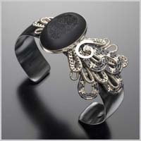
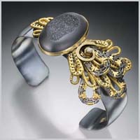
Here are two samples. See how much better the second photo shows off the piece.
|
Poor Lighting |
Good Lighting |


